"Art is humanity’s greatest tool for insight."
Many things get lost in time. The power that book artists’ wield is their ability to conjure up the lost. And at their disposal are an array of techniques that only heighten the effectiveness of words (the two play off of each other, in a way), from the delicate scent of wood that whisks past your nostrils, the feeling of a page gliding across your fingertips or the way colors are absorbed by the paper and create feelings and meaning beyond what you’ve read. And when you’ve come to the end, everything lingers and sits with you—the book is back in its box, housed in closed stacks, but those feelings and information still remain. At that moment, nothing and no one is lost in time. The foresight that goes into creating an artists’ book is nothing short of astonishing.
I am privileged to talk about book artist Tia Blassingame. She immerses herself in that lost world and hauls back bodies that carry emotions and lives that we couldn’t understand before but begin to understand now. That is both impactful and powerful. So, let’s get into who Tia Blassingame is, her many accomplishments, and her incredible talent:
"Tia Blassingame, the proprietor of Primrose Press, is a book artist, printmaker, curator, and educator exploring the intersection of race, history, and perception. Utilizing printmaking and book arts techniques, she renders racially-charged images and histories for a nuanced discussion on issues of race and racism. Blassingame holds a BA in Architecture from Princeton University, an MA. in Book Arts from Corcoran College of Art + Design, and an MFA. in Printmaking from Rhode Island School of Design. Her artists’ books and prints can be found in library and museum collections around the world including the British Library, Library of Congress, Rijksmuseum, Metropolitan Museum of Art, Tate Britain, Bayerische Staatsbibliothek, and National Museum of Women in the Arts. In 2019, Blassingame founded the Book/Print Artist/Scholar of Color collective to bring Black, Indigenous, and People of Color (BIPOC) book artists, papermakers, paper engineers, letterpress printers, and printmakers, into conversation and collaboration with scholars of BIPOC Book History and Print Culture, to build community and support systems. Blassingame co-curated the National Education Association and Center for Craft grants-awarded Paper Is People: Decolonizing Global Paper Cultures, a traveling exhibit in 2023 with book artist Stephanie Sauer. Blassingame teaches book arts, including papermaking, printmaking, and letterpress printing, nationally and internationally."
The Book Arts Collection, part of Los Angeles Public Library Special Collections, holds about 900 items, including fine press publications, broadsides, and artists’ books. The materials feature many bookbinding structures and printmaking techniques, endlessly adapted to the maker’s personal expression. All items are available to view by appointment only, which may be requested by filling out a form via our website.
Special Collections currently holds two of Blassingame’s artists’ books: African American: A Handbook (2020) and Black: A Handbook (2022). They are part of a handbook series—two of which Special Collections, unfortunately, does not have: Negroes: A Handbook (2015) and Colored: A Handbook (2020). Blassingame describes the intent behind these handbooks on her site Primrose Press: “What would it look like if each African American man, woman, and child had a handbook? A guidebook that would give you insight into who they are, what they feel, and their accumulated experiences. Such books could show the diversity of the African American experience and maybe help white Americans move beyond prejudices and stereotypes. These guidebooks might help white Americans empathize with their African-American counterparts.”
Combining various book art techniques—as mentioned in her artist statement—Blassingame’s handbooks embody an African-American experience that transports the reader through different eras of Black existence. On a larger scale, Blassingame’s work targets contemporary and historical racism in the United States. Her hope is to allow the artists’ books to engage with the reader in a conversation about racism. Even though the materials and methods used have a deeper meaning and purpose, on a surface level, they are also used to seduce the viewer, which I find to be brilliant because race, especially the African American race in the U.S., is a very sensitive conversation. Creating an atmosphere that removes the intensity long enough to capture their eyes and minds is a great way to provide insight to people who have been stigmatized as less than human.
There are so many elements to these handbooks, it would be more appropriate to have Blassingame share a little with us about them. I am so very grateful that she obliged.
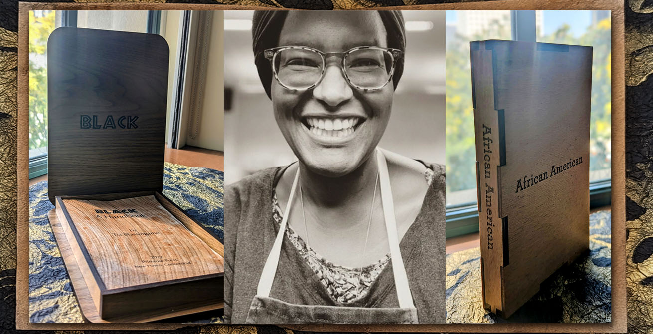
The first handbook, African American, is 5.5 x 8 inches and stored in a persimmon and indigo-dyed, laser-engraved, birch wood container that still holds a soothing woody and earthy smell.

It is a limited edition of 20 copies, this copy is #5. The pages are persimmon and indigo-dyed paste paper with original poetry by Blassingame. The use of indigo is common in the two handbooks and an interesting choice given the history and symbolism behind it. It is a color of power in Western Africa and also ties into the African slave trade as a form of currency for the purchase of African bodies. The process of achieving these vivid colors on the pages is just as remarkable as the finished product. Blassingame goes over what that process entailed: "The dyeing process involved the darkening of the paper over a thirty-day period to a deep, rich brown hue. During that time, the paper was regularly burnished to heighten its glossiness and lacquer-like appearance as well as dyeing with indigo." Typically, the value of a book is determined by its contents. The outer shell is often overlooked and used merely to draw in the reader with a visual representation. What I love about artists’ books is that the container is just as valuable and informative as its interior. The shell, the colors, and the materials used all carry meaning that only adds to the words. Let’s learn more about this handbook and how more than just the words hold significance.
I noticed that there are recurring materials used, like wood and persimmon juice. Do these materials specifically represent anything relating to African Americans?
Brown for me usually references the skin and skin tones of the African diaspora. At times the ink or dye colors are stand-ins for people lost to time, memory. The containers that differ across the series reference the different types of book housings like slipcases, lidded boxes. Moving me away from the standard clamshell box, which, while however lovely, is, I feel, overused.
I am always interested in the first chapter of a book more so than the last. That first chapter sets the tone of the book and determines the ending. So, I want to talk about the 1st chapter of each of your artists’ books: In African American, Chapter 1 is "Wish You Were Here" which is incredibly beautiful and sets the tone. Why did you choose this as your first poem?

This poem represents the first text that I ever typeset and printed, which was during an artist residency at the Anderson Center for Interdisciplinary Studies, Red Wing, Minnesota in 2004. Mild rumination on the experience of printing my own writing, trying not to edit it, editing and re-editing while setting it. I continue to use my own writing in my artists’ books so the inclusion of this poem at the start reminds me of my love of letterpress printing some twenty years since that first experience.
Black, is 5.4 x 8.4 inches and stored in a wood container. It is a limited edition of 40 copies, this is #19. The pages are persimmon, ash, iron oxide, and indigo-dyed paste paper. This is the handbook I truly felt kindred to. There is a revolutionary pain and power in Blassingame’s poetry that speaks volumes. Perhaps her emotions during the years leading up to 2022 were emotions that I, too, shared. Emotions about the state of the country, Black people, and the continuous murders, injustices, and protest movements about the same things we have long, always fought for.

The color scheme displays darker tones in comparison to its companion pieces, light blues, and browns. These darker tones, wood patterns, and typesetting all connect to the emotions and mental imagery I have of African Americans during that specific era of Black pride and Black revolutionaries. The poetry is moving and, at times, prideful—from chapters such as "Poison Oasis," "Waiting Room," and "Ertha Kitt and Orson Welles." Each chapter tells a story that can be visualized and felt. The way Blassingame is able to unify different techniques of artistry to convey equally as many messages is mesmerizing.
In Black, Chapter 1 is "Human," and I specifically love the poem but also the colors used, the pattern, and the small singe mark at the bottom of the page. In comparison to "Wish You Were Here," it is immediately noticeable that there is a different emotion coming out of "Human." Why did you choose this poem as your Chapter 1?
Human is a response, a call, a declaration. The increasingly blatant anti-Blackness in the U.S. and around the world, or the way enslaved people of African descent were viewed as less than, slaves instead of people, seem to call for a response. Or rather the internal dialogue of a person existing in the world today, yesterday, in the future that is not seen as or treated as a human being.
Do each of the books take on a characteristic based on the name and therefore represent a different version of us based on timeframe, perhaps?
I start by considering the time range when Black people in the states were popularly identified as, identified themselves as Colored, African American, Black... Those ranges are porous, overlap. This allows my mind to wander as I am working on the project. Imagined futures can as easily be incorporated as dreams and wishes of the past. That is very freeing since typically within each project I give myself very tight perimeters.
It seems every detail and aspect of these artists’ books are intentionally interconnected. Do you know beforehand how they will connect, or do they fall into place as you discover and research?
I tend to know well in advance what relationship I want the book to have with the reader/viewer. That desired relationship dictates size, materials, color, printing techniques, binding, type size, etc. This is why when you look across my catalogue of artists’ books, they look very different. While there is a style, they may not look cohesive.
You mentioned that you know in advance what relationship you want the book to have with the reader/viewer. What relationship did you want the reader/viewer to have with the handbook series?
With the handbook series, I wanted the color schemes, textures, and tacility to be slightly off-putting when viewed with the title, and text against the readers’ presumptions or stereotyping of the subject matter, protagonists and their experiences. Some readers may see their histories and futures in the handbooks, and still others may not relate because some chapters are very specific. They may not jib with their view of Blackness. Their relationship with each title will develop slowly with each touch and flip of the page. It may seem insignificant in the moment, but it will linger with them. For some, it will trouble them because the color scheme, textures, and writing do not align with their understanding, as in Negroes: A Handbook for example. With the later handbooks that incorporate burnishing and persimmon juice, the pages can feel seductively smooth. Metallic and iridescent pigments in African American: A Handbook for example, may cause the reader to pause, moving the page back and forth to allow light to rake and move across the shimmering page. Such interactions with the handbooks through sight, and touch allow the book and memory of engaging with them to seep into the reader, and may continue to affect the reader long after their time with the books.

So what is next for Tia Blassingame? Well, excitingly, she is continuing the Handbook series with an additional book that should be debuting in a few months.
Special Collections recently purchased a portfolio of prints titled, Foreword: Black & Brown Hands in Book Arts/ Histories & Print Making/Cultures. Blassingame provides more insight about this portfolio:
"The Collective's inaugural print portfolio focuses on the theme of Black and brown hands creating in the book arts, printmaking fields, and beyond. Foreword features prints by letterpress printer Ben Blount, hanji maker Aimee Lee, and Blassingame with a written reflection by Smithsonian Libraries and Archives director Tamar Evangelestia-Dougherty. This yearly series continues with a different group of collective members and will be available at the end of the year. Sales proceeds are shared between participating members and the collective. The collective's portion covers expenses like the portfolio container materials, shipping supplies, and honorariums for the next year's participating members."
Also, Special Collections has pre-ordered Blassingame’s forthcoming artists’ book The Benefits of Slavery, which is the product of intensive research of the Atlantic slave trade in Providence, Rhode Island (more can be learned about this on Primrose Press or her Instagram @primbookart).

Many thanks to Tia Blassingame for dedicating some time to answer some of my questions. This was an exciting interaction and I hope to have more in the future. Lastly, I want to add that I learned a great deal about Tia’s artistry and her research from videos she has posted on YouTube. If you are interested in learning more I highly suggest giving them a watch: The Texture of Racism & Slavery in the United States and Erasing Hate: The Artist's Books of Tia Blassingame.